WhatPay: UX/UI Analysis v2
Captured via iosef + comprehensive teardown covering architecture, UX issues, App Store strategy, and competitor analysis.
App Flow Screenshots
 01_launch
 02_home
 03_detail
 04_scroll
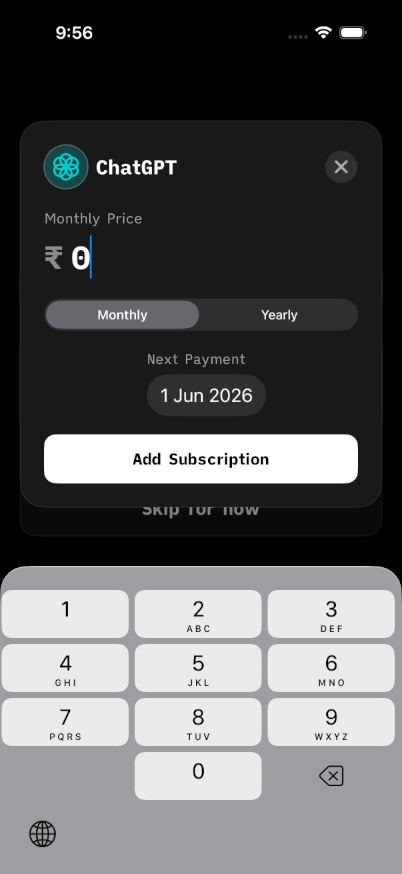 05_add
 06_back
Captured via iosef — unique hashes verified
App Architecture
What am I paying/
├── ContentView.swift           # Main dashboard (50K chars)
├── NewSubscriptionView.swift # Add/edit subscription (43K chars)
├── OnboardingView.swift      # First-launch onboarding (3.7K chars)
├── QuickAddOnboardingView.swift # Quick-add tutorial
├── UIComponents.swift        # Reusable components (14.6K chars)
├── CategoryChartView.swift   # Analytics/charts
├── CloudKitManager.swift      # Data persistence
├── SoundManager.swift         # Haptic + audio feedback
├── NotificationManager.swift  # Renewal reminders
├── SubscriptionWidget.swift   # iOS Home Screen widget
└── SharedModels.swift        # Data models
Debt Warning: 50K line ContentView suggests mega-component. Consider splitting into DashboardView, SubscriptionList, SpendHeader.
UX Issues & Fixes
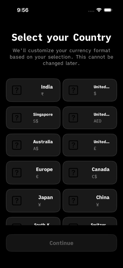
Onboarding Trust Deficit
Financial app with zero security messaging. No "Your data stays on device" badge. Users abandon here.
→ Fix: Add trust badge + light secondary CTAs to WCAG AA
Add Form Missing Smarts
No auto-category from subscription name (Netflix → Entertainment). No smart defaults.
→ Fix: Add ML-based category suggestion from merchant name
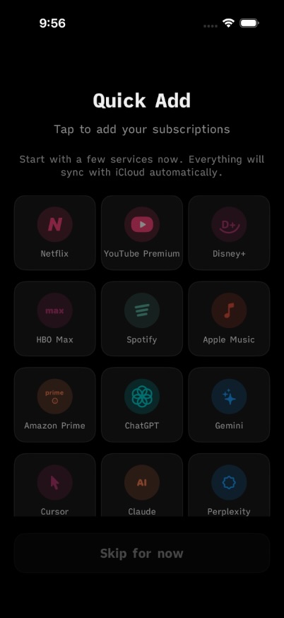
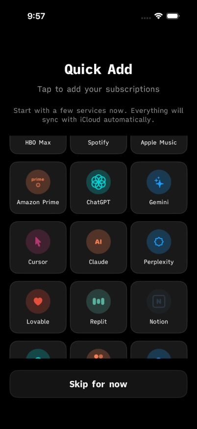
Multiple Opt-outs Done Well
Onboarding offers "Skip" and "Remind me later" — respects user autonomy.
App Store Competitor Analysis
Screenshot Patterns from Top Finance Apps
Pattern: "Stop drowning in debt" → "Start spending confidently". Problem → Solution arc. Consistent purple throughout.
Pattern: Quantified value upfront ($720/year saved) → Feature → Benefit. Dark theme, one action per screen.
Pattern: Minimal overlay. Large "Safe to Spend" number hero. Clean white background, let UI speak.
WhatPay Screenshot Gaps (v1.1 Blockers)
- ✗ No EMI tracker in screenshots (major Indian differentiator)
- ✗ No widget preview (iOS 16+ feature)
- ✗ No total spend hero number ("₹2,847/month")
- ✗ No problem → solution narrative arc
- ✗ Missing 5.5" and 6.7" screenshot sizes for ASC
Recommended Screenshot Sequence (v1.1)
Hero Total
"Know what you pay" — Dashboard with ₹2,847/month prominently displayed. Immediate value comprehension.
The Problem
"Too many payments to track?" — Scattered services (Netflix, Prime, EMI) → organized list.
Quick Add Flow
"Add in 3 taps" — Improved v1.1 form with live preview card below.
EMI Tracker (NEW)
"Track EMIs too" — Progress ring "12 of 36 months". Indian market differentiator.
Insights
"See where money goes" — Monthly vs yearly toggle, category breakdown.
Widget + iCloud
"On your home screen" — Widget preview with iCloud sync badge.
Action Items
- ○ Add trust badge to onboarding this week
- ○ Capture 6.7" and 5.5" screenshots for ASC
- ○ Design EMI tracker screen if not built
- ○ A/B test: "Know what you pay" vs "Track subscriptions & EMIs"
- ○ Future: Split ContentView (50K lines) into components